

Some albums just have a way of affecting my mental state. This is one of those. There are no tracks on this entire album that have any light. It’s all-consuming darkness wrapped in a black cloak of dread and tied up with a ribbon made of angst. And instead of pushing me away, it pulls me in deeper.
I don’t enjoy happy metal. I think it might be why I’m so averse to Power Metal. The experience built on this album is built through various mechanisms. Slow riffs that are heavy and deep in tone. Atmospheric elements, almost like deep horns breaking out of the fog of despair. I find myself imagining being lost at sea in a mist. No light. Horns of the other ships, blasting their deafening wails, like immense creatures caught in the darkness, trying to find their way out before being impaled by the jagged rocks at the shoreline.
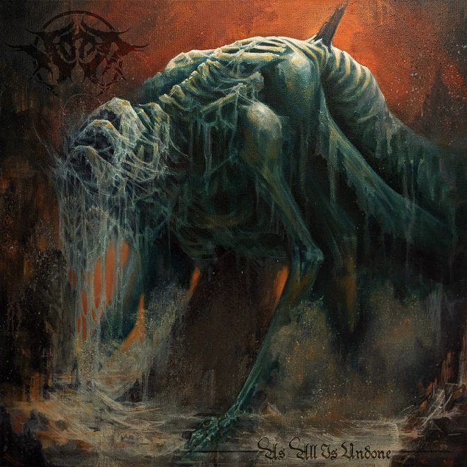
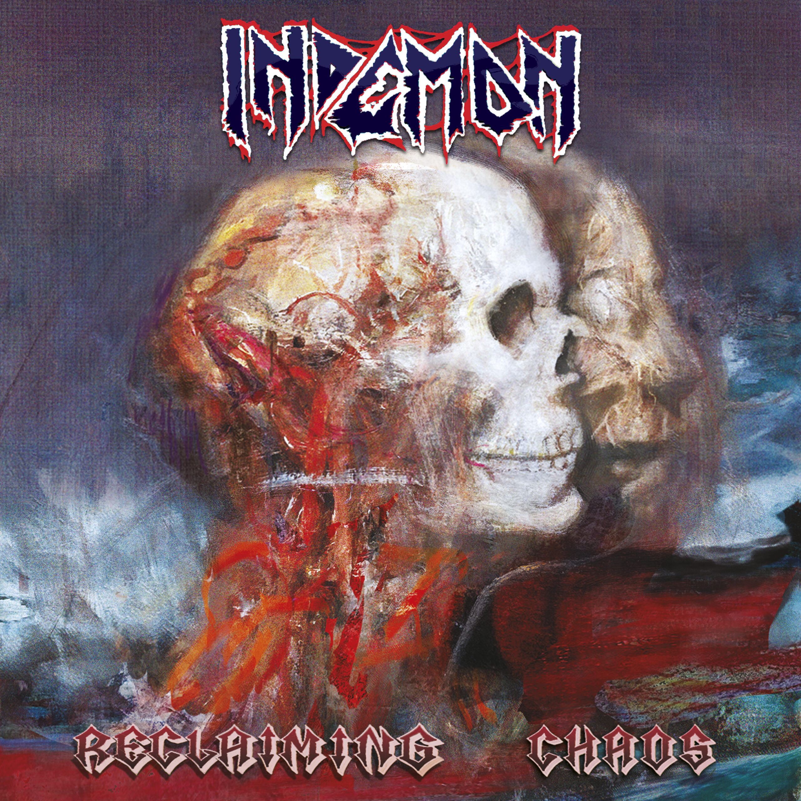
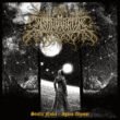
Part of my description of what I felt while listening to this album was influenced by the artwork on the album cover. I imagine this giant creature being swept into and finally impaled on the coastline. While it does appear to be something born in the nightmares of children, I can’t help but feel a little sorrow for its death. Part of the album description on Bandcamp states, “This is a semi-concept album, built from the bones of the ‘seven stages of grief,’ but twisted into something bleak and upsetting.” Taking the cover into account with this description, I get feelings of grieving things we really shouldn’t. A bad relationship that has ended. A decade-long struggle with addictions that we still feel a lingering want for. Grieving changes in our lives that are for the good, but somehow we still miss them.
My one critique of the album cover is the way the logo and the name have been added. I understand not wanting to distract from the artwork; however, I feel it could have been done in a way that still allows the band logo and album name to be more visible. Using some of the colours in either the background or creature to tie them into the design as a whole would have allowed for these elements to still blend in while also not being difficult to see – as they currently are. The font choice for the album name works well with the music and the imagery. The decision to frame the album name in the lower right corner with the leading and trailing lines could have been unnecessary had a different colour been used for the font.
The Bottom Line
I was initially disappointed visiting the Bandcamp link for this album because there was no physical media listing. I can see now that vinyl options are available. This is good as I need to have this album in my physical collection. I continue to hear more vocal styles, riffs, arrangements, and other elements that pull me deeper into the experience built on this dark masterpiece. Currently, this is in my top 3 albums for 2026. It reminds me of the darker tracks on Whitechapel’s Hymns of Dissonance, but it’s an entire album of succumbing to the darkness, and I love it.